This article is within the scope of WikiProject Japan, a collaborative effort to improve the coverage of Japan-related articles on Wikipedia. If you would like to participate, please visit the project page, where you can join the project, participate in relevant discussions, and see lists of open tasks. Current time in Japan: 04:08, June 24, 2024 (JST, Reiwa 6) (Refresh)JapanWikipedia:WikiProject JapanTemplate:WikiProject JapanJapan-related articles
This article is within the scope of WikiProject Trains, an attempt to build a comprehensive and detailed guide to rail transport on Wikipedia. If you would like to participate, you can visit the project page, where you can join the project and/or contribute to the discussion. See also: WikiProject Trains to do list and the Trains Portal.TrainsWikipedia:WikiProject TrainsTemplate:WikiProject Trainsrail transport articles
Latest comment: 10 years ago7 comments5 people in discussion
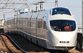
Which photograph do you feel more beautiful? I recommend a left photograph. A right photograph has complicated scenery other than a train. Moreover, when this train is seen from width, it looks the most beautiful.
I'm not sure that "beauty" is the prime criterion here, and it will be very subjective anyway. For reference, the following images are available at Wikipedia Commons, including the image that was used in the article since December 2012. In my opinion, all of these images are of higher quality and are more appropriate as the top image for the article than the older (March 2005), relatively low-resolution (1,152 x 720 pixels, 127 KB) and over-exposed image that has recently been added to both this and the Romancecar article. --DAJF (talk) 05:44, 27 November 2013 (UTC)Reply
4,288 x 2,848 pixels, May 2010
1,600 x 1,200 pixels, February 2012
3,593 x 2,300 pixels, December 2011
1,280 x 960 pixels, March 2013
DJAF is correct. The high-quality, properly-exposed pictures should be used - the one you are suggesting is an extremely poor choice. Pi.1415926535 (talk) 03:48, 28 November 2013 (UTC)Reply
I can understand both points of view here. The images preferred by DAJF are more recent, and are at least generally better quality images in terms of exposure (although I would prefer one of the alternatives to the March 2013 image that isn't as dark as that image (this one, perhaps?)). I also think that STRONGlk7 has a point in suggesting that an image with background clutter should be avoided, and that the train looks better from the side than from the front. In my opinion, the best solution to the problem would be for someone to take and upload to commons some better quality side view images, and then one of those images could be used. There are some good examples here, here and here of the sort of images I have in mind (and yes, I acknowledge that one of these examples is a little blurry - images such as these should be taken with a fast shutter speed). Bahnfrend (talk) 09:06, 28 November 2013 (UTC)Reply
I think the old one was better tbh! The new one is badly framed, over exposed and not very sharp. It is poor from a photographic point of view, regardless of whether the angle might be better (which I don't think, but that's a matter of opinion). G-13114 (talk) 09:15, 28 November 2013 (UTC)Reply
If you're gonna ragequit over being told a poor-quality image is not a good choice for an infobox, your loss. Pi.1415926535 (talk) 15:44, 4 December 2013 (UTC)Reply
Latest comment: 1 year ago1 comment1 person in discussion
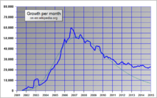
Why is having such close numbers needing low precisions? There is a relatively large difference between having 0 and 1 decimal place in this instance QuarioQuario54321 (talk) 14:26, 4 May 2023 (UTC)Reply


